Arcis is a private equity firm located in Dallas, Texas. They were in need of a website redesign and requested a layout that would lend it's self to both their equity and golf websites. Since both operate under the same parent company, they wanted them to be visually consistent.
It was important to the client that the site excude high-quality and professionalism. Their primary target audience is typically mature and established adults so the aesthetic should relfect that lifestyle. Featuring photos of the properties was a must and having them visible at all times was ideal for the client.
Homepage
Two-Column
Three-Column
The sites are broken down into three templates. A single column, two-column and a three-column template. The single column template is used as an impact page for each homepage, featuring either a full page background image or background video. The two and three column templates both feature an image gallery on the far right, which gives the ability showcase the photos of the properties. The three column template also incoporates a local navigation, which is used to scroll to a given piece of content or dive deeper into an interior section, without leaving the page.
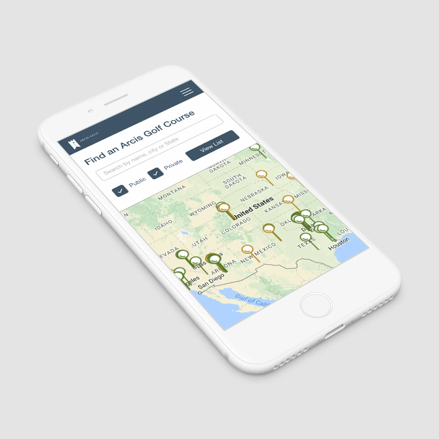
One unique feature of the golf website that is not incorporated on the equity site was the ability to search for clubs throughout the United States. The user can choose to view private, public or both types of courses. Each listing features information, photos and course map for that specific course.
To the left is a prototype of how I envisioned the course search working on mobile. (It ended up being developed a little... different)
On desktop / tablet the map and listing views are visible simultaneously
On larger screens you also have the ability to scroll through listings while the courses photos are availiable to the right.
The idea of having interactive course maps was suggested but was rejected since not all courses have detailed maps.
A kebab icon indicates that an item has deeper level menu items.
Large UI components help the user filter results up top. Text links were used instead of iconography for the course actions because it conserves vertical space (which is crucial on mobile), is more direct for the target user and avoids confusion.
A full screen overlay was used for the course detail. This was chosen to keep the smaller screens uncluttered if multiple pins were selected. A clearly visible exit option is provided at the bottom of the screen.


